© Opel
New Opel Brand Identity
Bold & Pure
Probably one of the most challenging and toughest jobs among my adventures, but at the same time one of the most exciting and instructive as well. A small core group, a fist full of people from McCann Velocity, the client, and myself worked very closely to achieve what you see here. With a lot of passion, trust and the will to go the extra mile we worked to create the brand identity that the Opel brand deserves.
client: Opel, international agency: McCann Velocity task: 360° Corporate Design Guideline / Brand Identity
Previous C.I.
Let’s have a quick look at the previous C.I. Admittedly, I must say that the benchmark was not a very high one. Opel needed change urgently and the lead client understood this. One thing for sure, Opel deserved something much better than what they had.


The Guidelines
My focus was on the guidelines themselves, the typography, the print guidelines, and online communication. I was also fortunate to work on and support every other part of the project as well – like the “Tone & Style” guidelines which you can take a look at further down.


Some examples from the guideline which had almost 400 pages.
Print guidelines
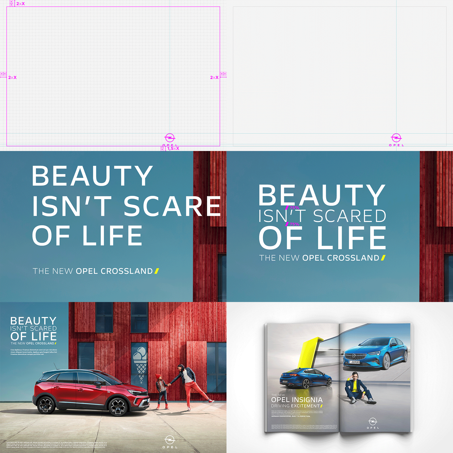
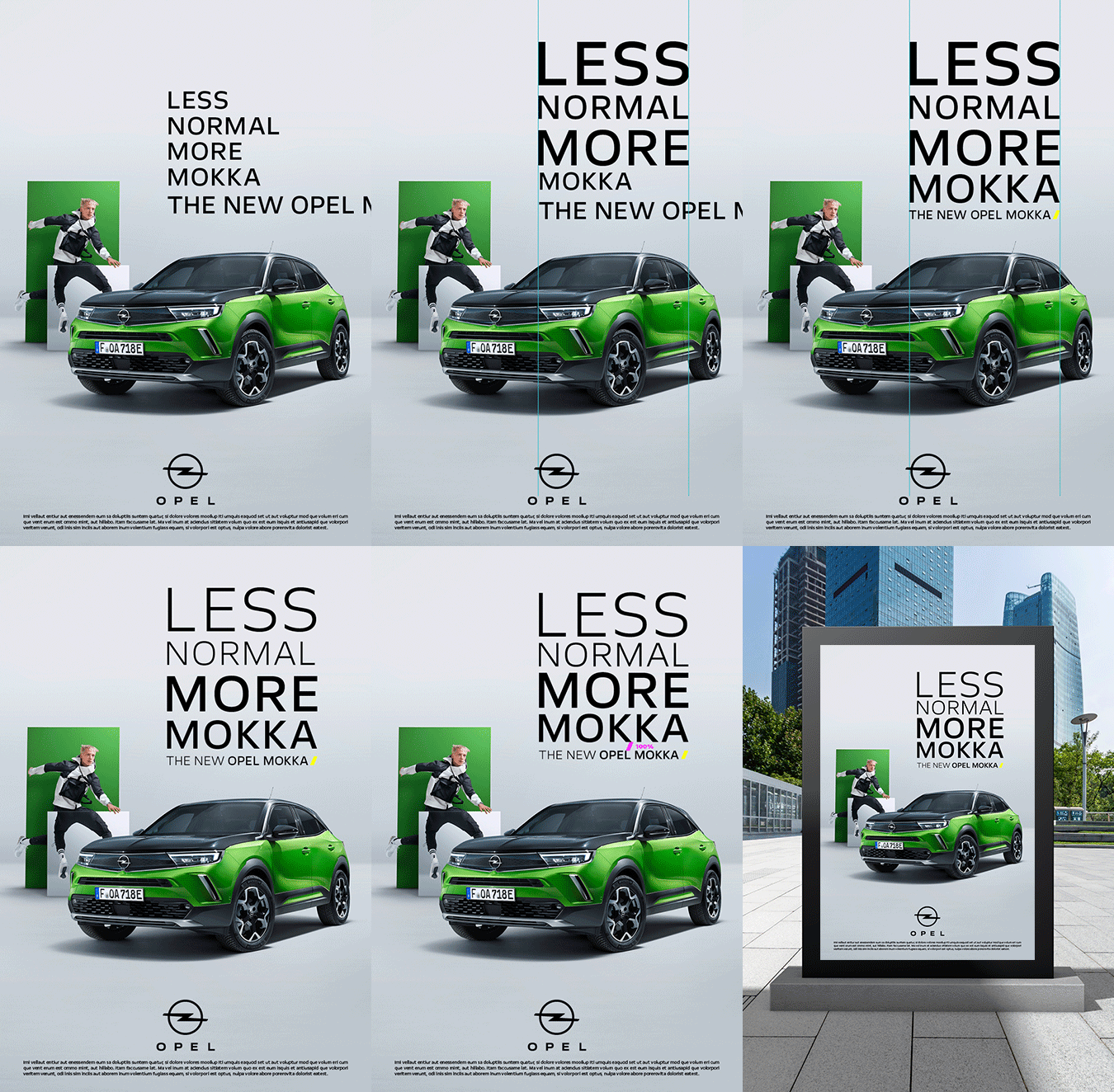
Next to the known parameters of the C.I. guidelines, the identity lives by the individual headline and of course the headline treatment. It has its own rules needed to make it work for every asset utilizing the “slash” as the key element.

Impressions from the print ADs guideline

Print guidelines are more than just finding a solution for magazine ads or OOH posters. Especially for an automotive brand where you have to set it up for all needs such as tactical, dealer, or topical communications.


Impressions from the OOH guideline


The Tone & Style booklet gives every creative exact guidance regarding how the brand should always look and feel. I love it.
Tone & Style
– concept layouts only

© Opel
GERMAN, EXCITING & APPROACHABLE.
And this is how Opel launched their new brand identity:

